Accounting and Auditing Board of Ethiopia
Making trust visible
Building a distinctive brand strategy and visual identity for the Accounting and Auditing Board of Ethiopia, an institution working to strengthen professional standards, accountability, and confidence in financial reporting.
The Institution
An identity built on responsibility.
The Accounting and Auditing Board of Ethiopia plays an important role in protecting the public interest through oversight of the accounting and auditing profession.
Its work calls for more than regulatory authority. It requires clarity, consistency, and trust among professionals, institutions, businesses, and the wider public.
Resolution Studio approached the assignment by connecting AABE's institutional mandate with a brand strategy and visual language that could communicate its values across every point of interaction.
From the values set out in AABE's brand guidelines
- Integrity
- Fairness
- Accountability
- Excellence
The Strategy
Before the design, a clear direction.
The work began by examining AABE's institutional role, audiences, communication needs, and aspirations.
The strategic direction focused on a recognizable, professional, and trustworthy identity, and on bringing greater clarity and consistency to how the institution presents itself.
The approach set out at inception
- 01ResearchUnderstanding AABE's goals, vision, services, values, audiences and media landscape.
- 02StrategyBrand core, visual identity direction, positioning and messaging.
- 03ProductionThe brand strategy document, the brand guidelines and the collateral.
- 04Knowledge transferTraining and guidance for AABE staff on using the brand.
From the Brand Strategy Inception Report, December 2023. The resulting framework defined the principles guiding AABE's positioning, personality, voice, visual expression and future communication.
The Mark
Continuity, expressed through form.
The Visual Language
A language of clarity and confidence.
The mark develops into a complete system: a palette led by institutional blue, two typefaces for two languages, and a flowing line pattern that carries the identity into every format.
Colour
Institutional blue leads. Its impression is one of confidence, stability, professionalism and dependability.
- AABE Primary
- HEX
- #1F4799
- RGB
- 31 / 71 / 153
- CMYK
- 98 / 84 / 4 / 0
- Secondary
- HEX
- #0B46AF
- RGB
- 11 / 70 / 175
- CMYK
- 96 / 79 / 0 / 0
- Tertiary
- HEX
- #053E80
- RGB
- 5 / 62 / 128
- CMYK
- 100 / 86 / 22 / 7
- Black
- HEX
- #000000
- White
- HEX
- #FFFFFF
- RGB
- 255 / 255 / 255
- CMYK
- 0 / 0 / 0 / 0
Typography
Two typefaces for two languages.
የኢትዮጵያ የሂሳብ
አያያዝ እና ኦዲት ቦርድ
Graphic Language
The lines, set free of the circle.
The flowing lines leave the emblem and become a pattern: placed on primary blue, on white or on black, always in one of the combinations the guidelines approve.
Logo Variations
Four approved pairings.
Each keeps ample contrast. The supporting logomark can stand alone where viewers already know the brand.
Applications
Designed to work everywhere.
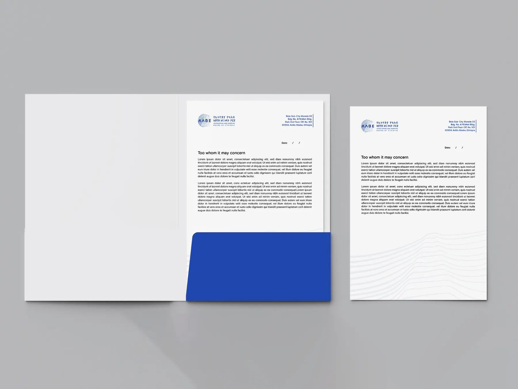
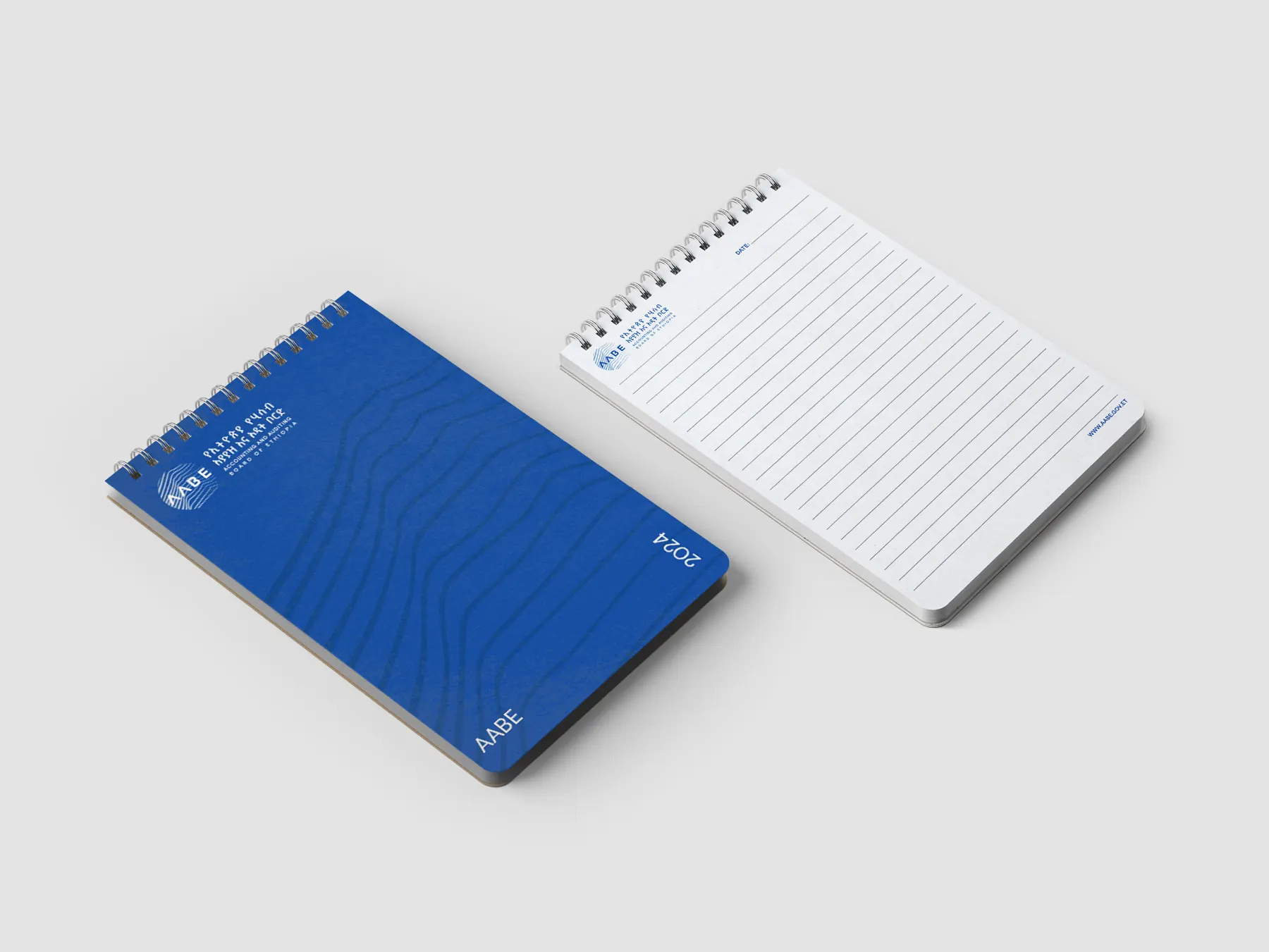
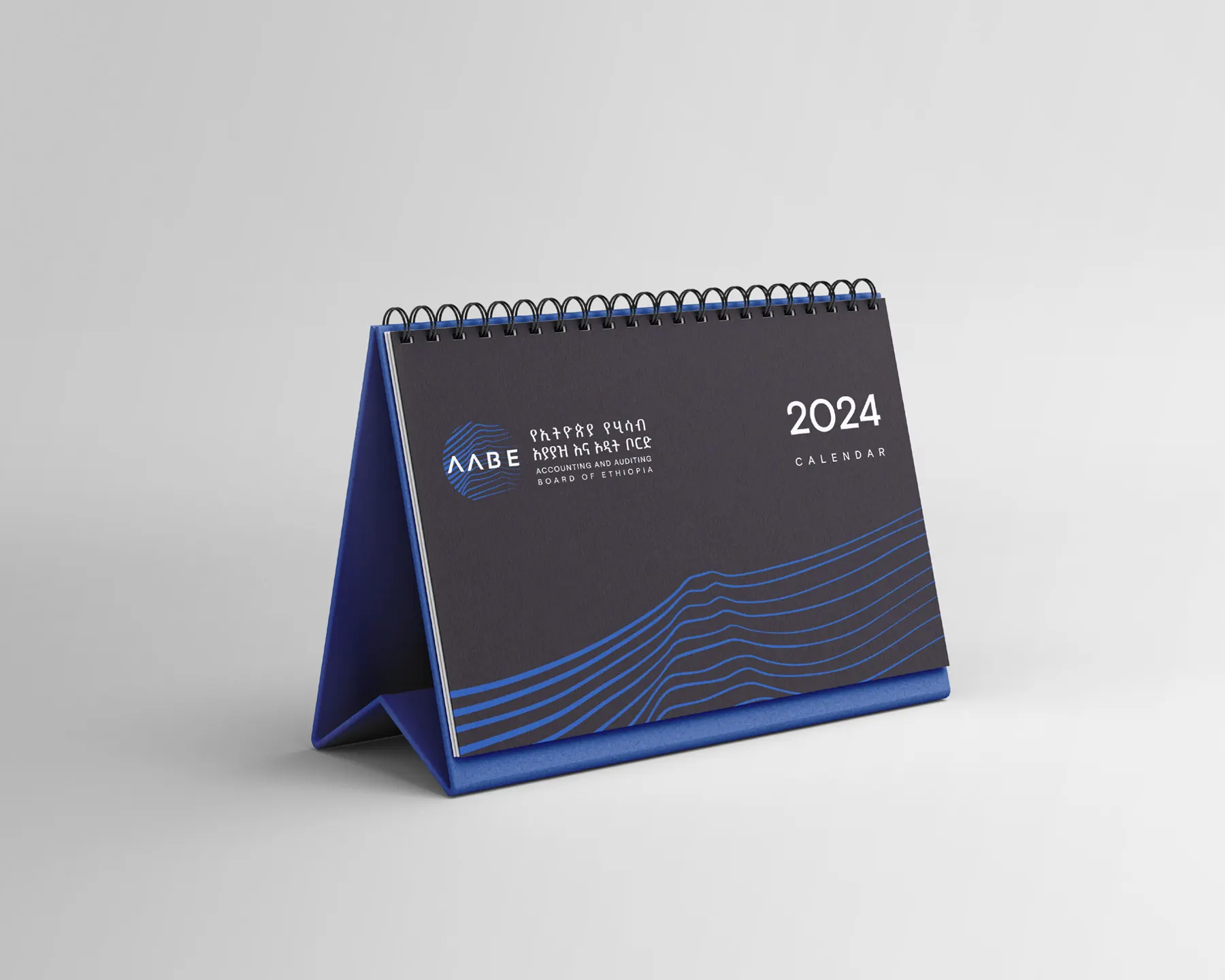
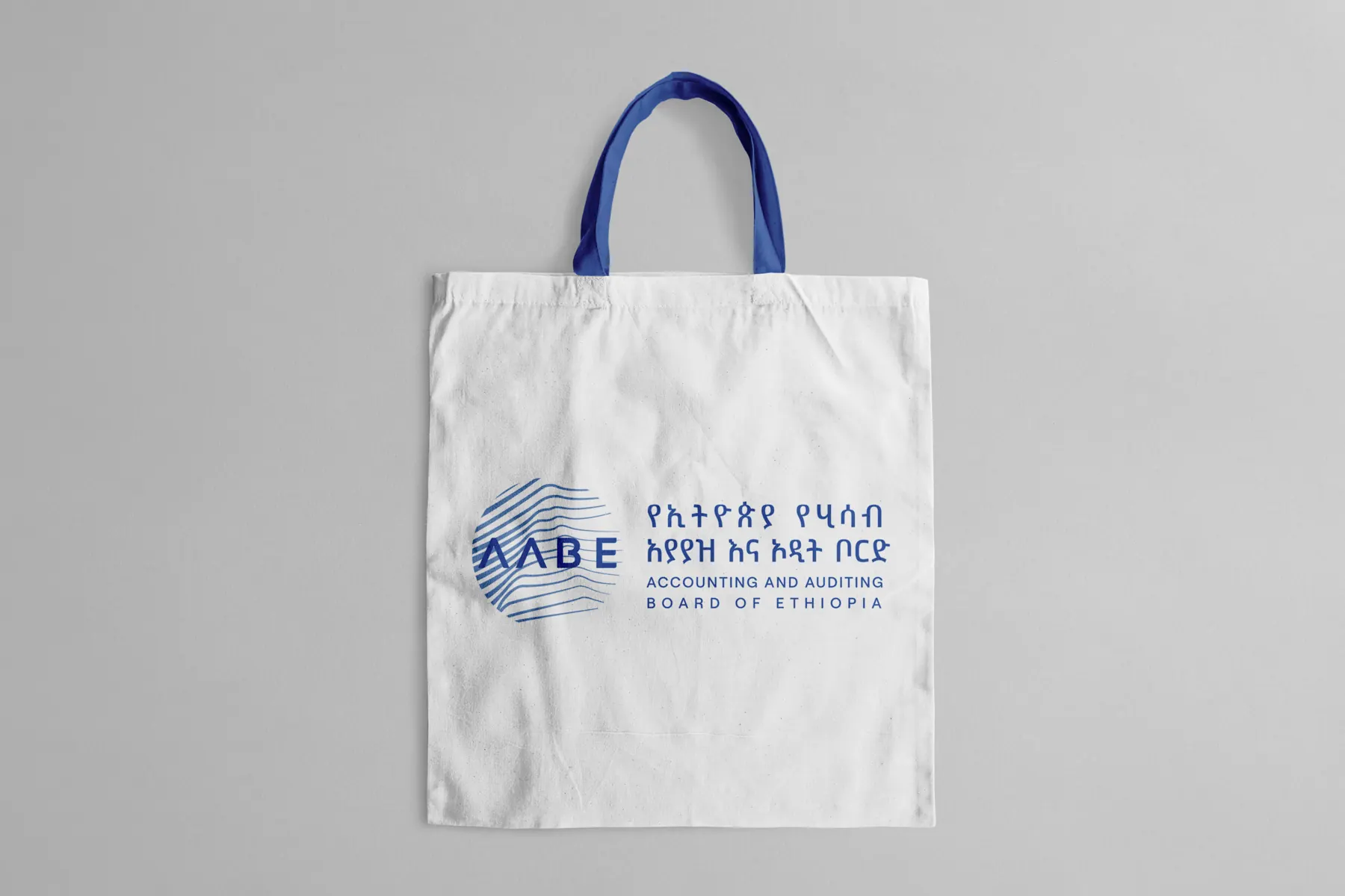
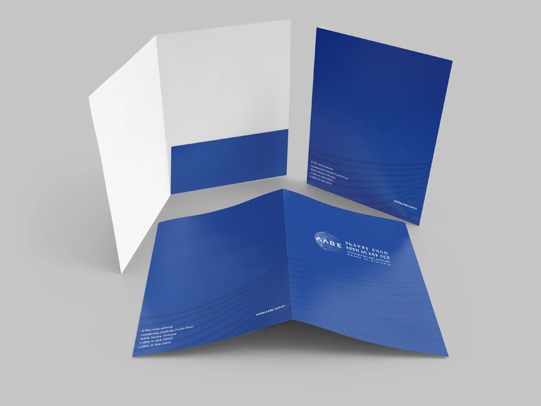
A strong identity is more than a recognizable symbol. It is a system that remains coherent across everyday communications, formal documents, public events, and physical spaces.
Business cards: reverse sides, rebuilt from the logo and pattern vectors.
For people, at events and at work.
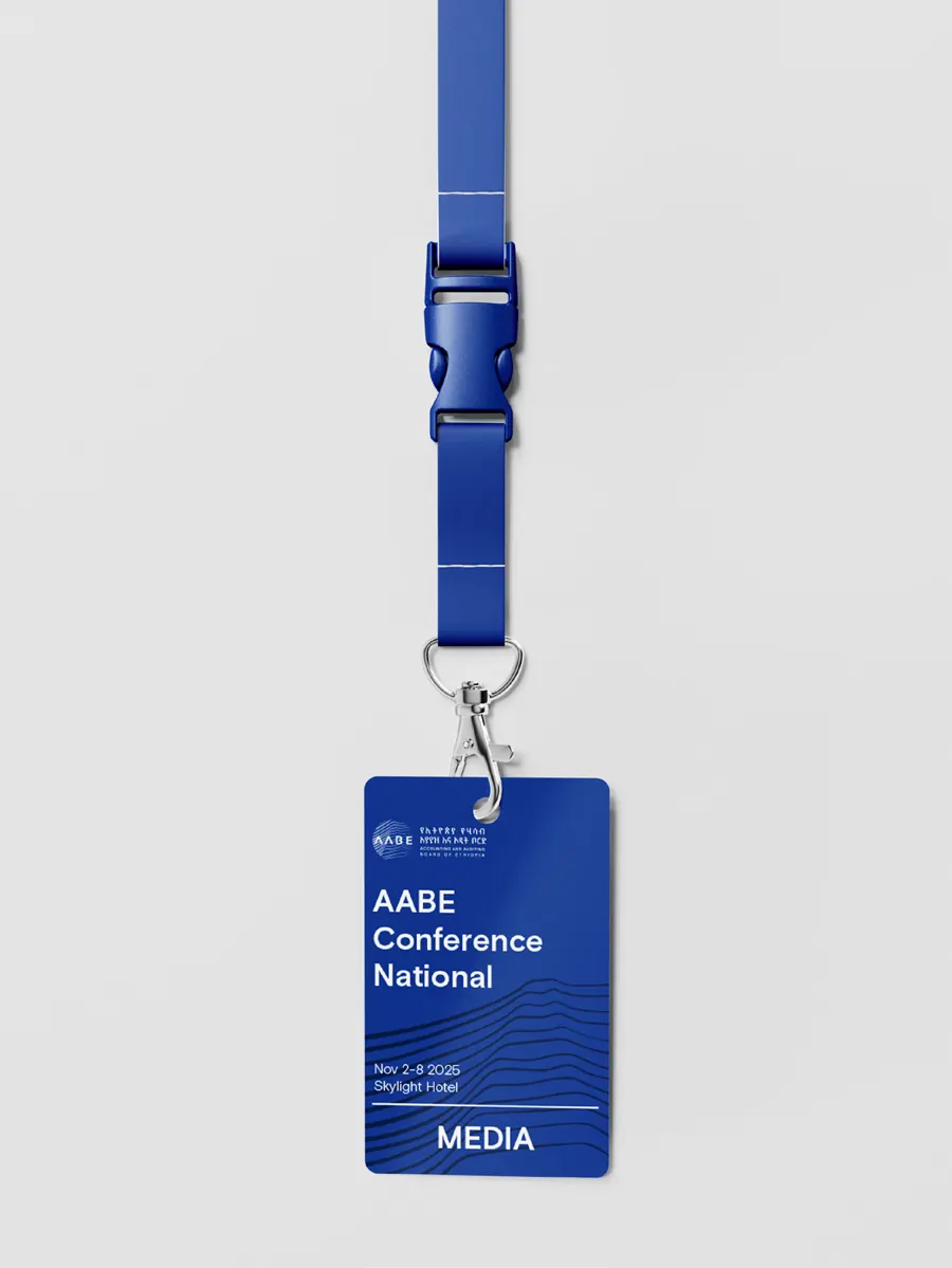
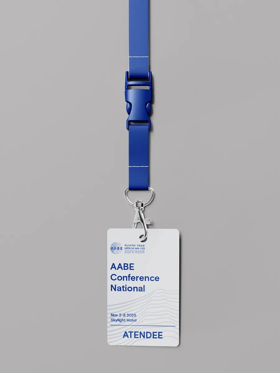
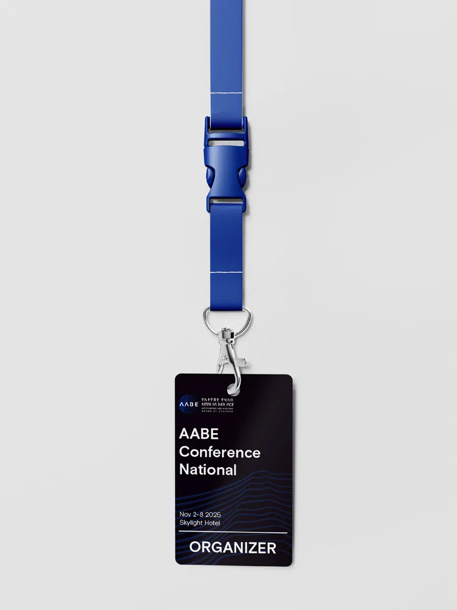
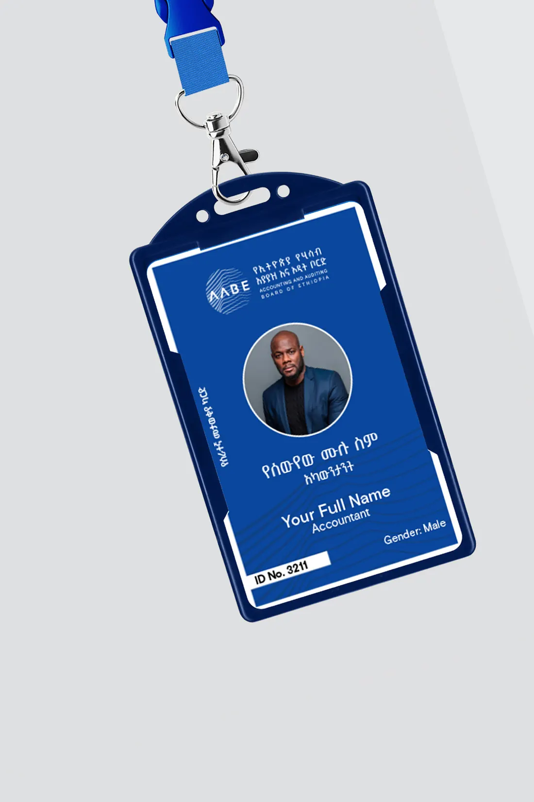
Event badges for media, attendees and organisers, and a staff identification card. Names, dates and details on these templates are samples.
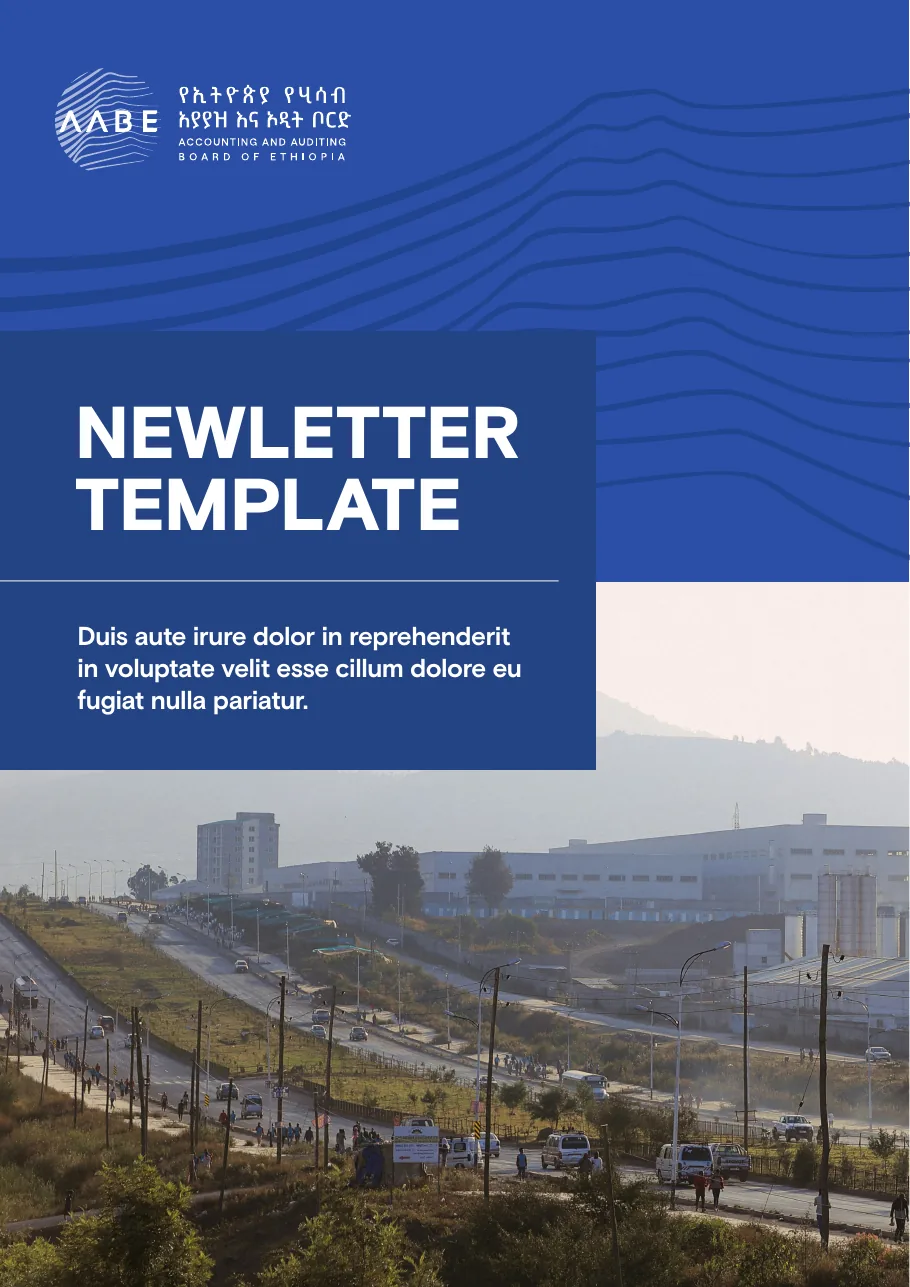
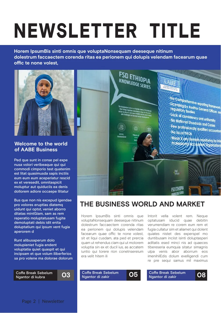
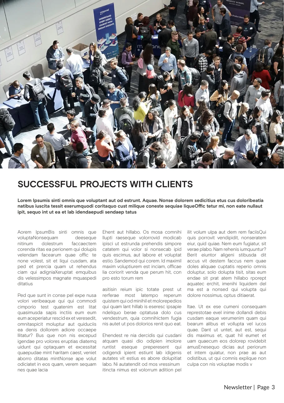
A publication system.
The newsletter template sets the pattern, the blues and Basis Grotesque Pro into a layout AABE's team can fill issue after issue. The copy shown is template placeholder text.
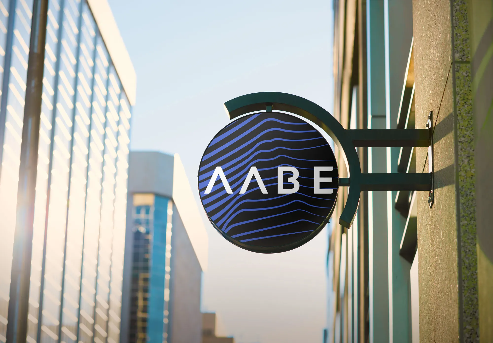
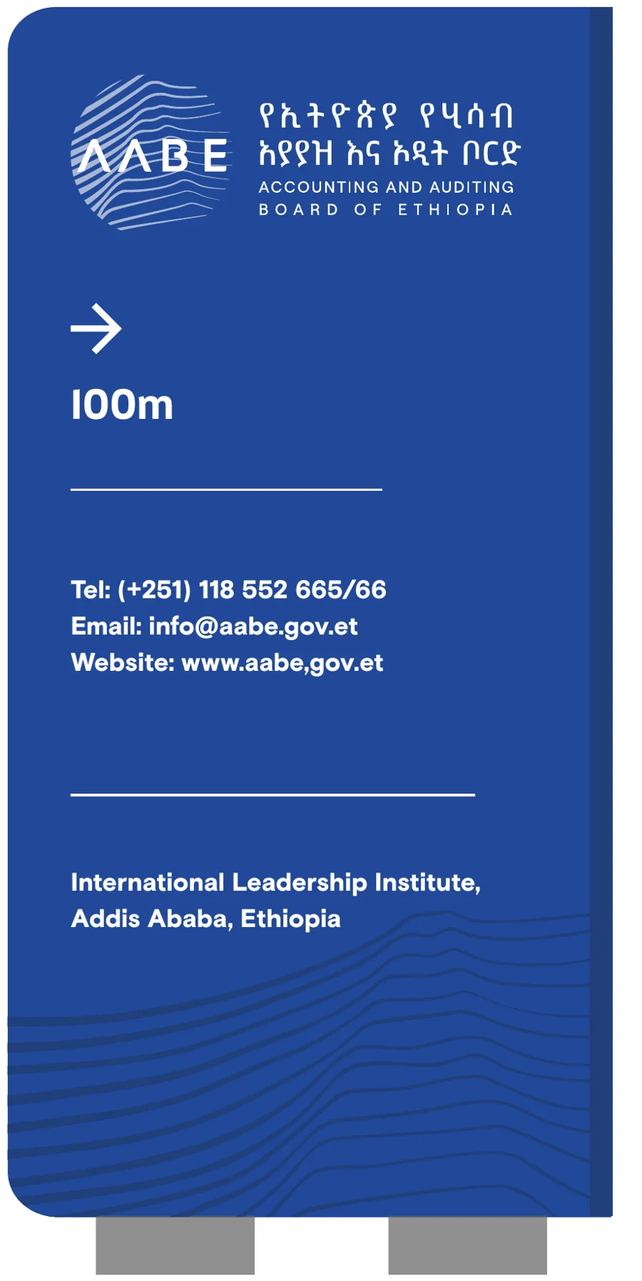
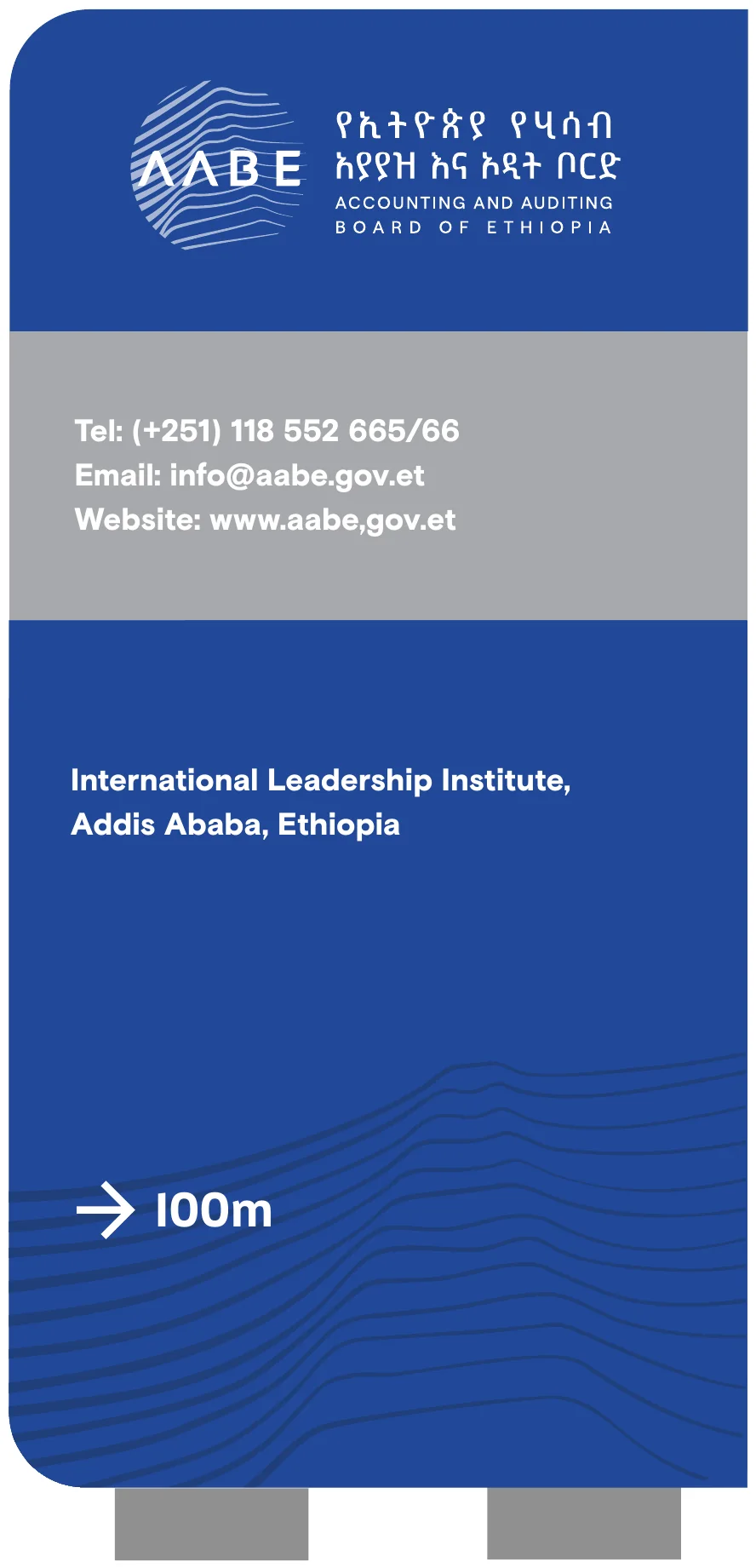
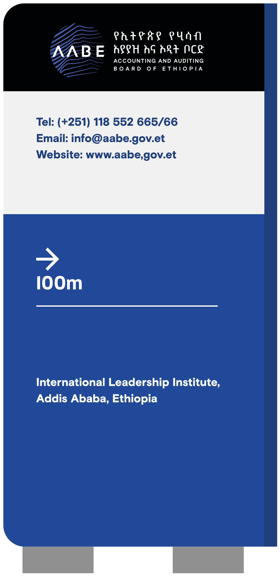
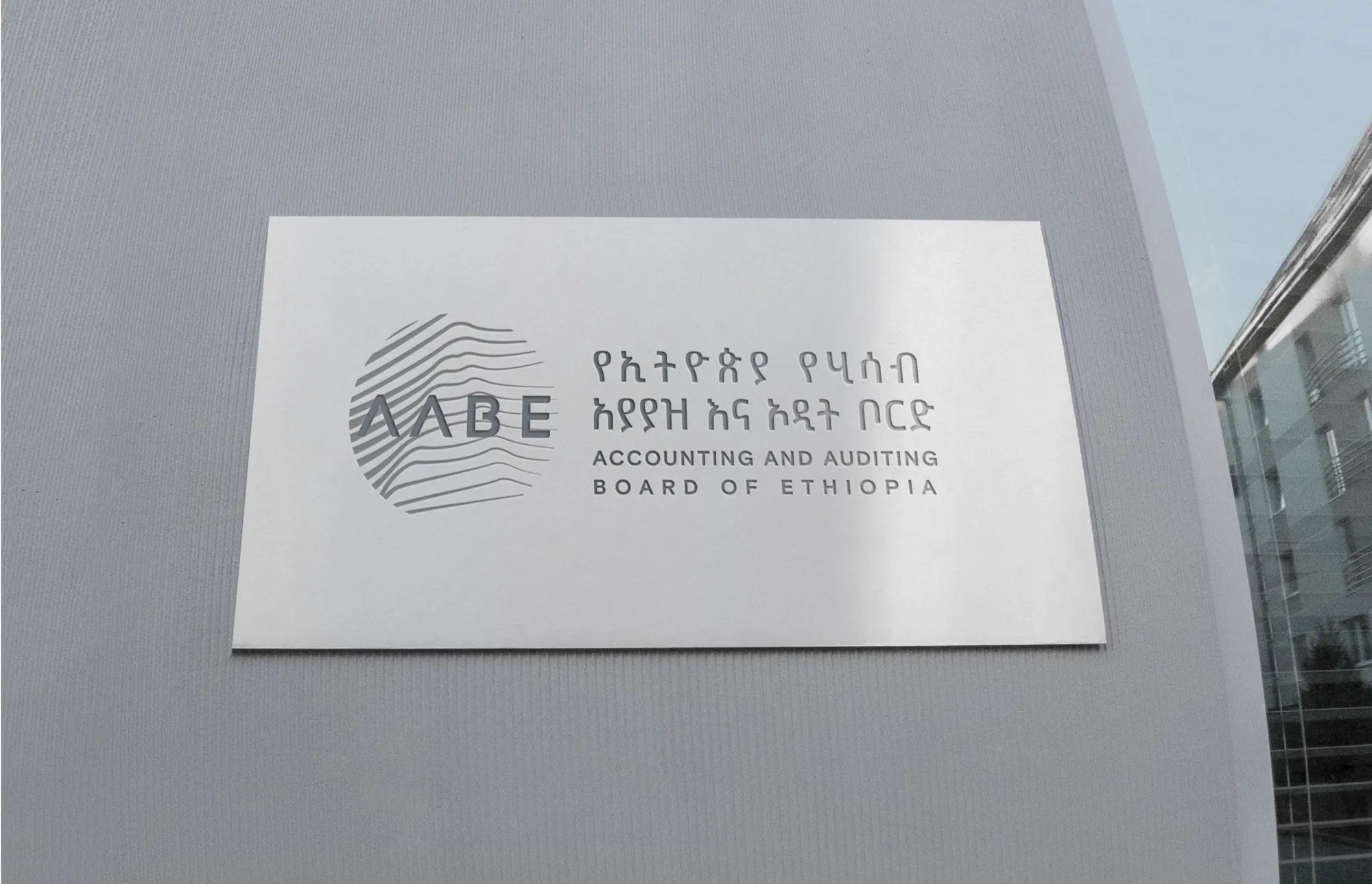
Wayfinding pylons from the outdoor signage artwork, beside a projecting sign from the brand guidelines.
The Environment
A presence beyond the page.
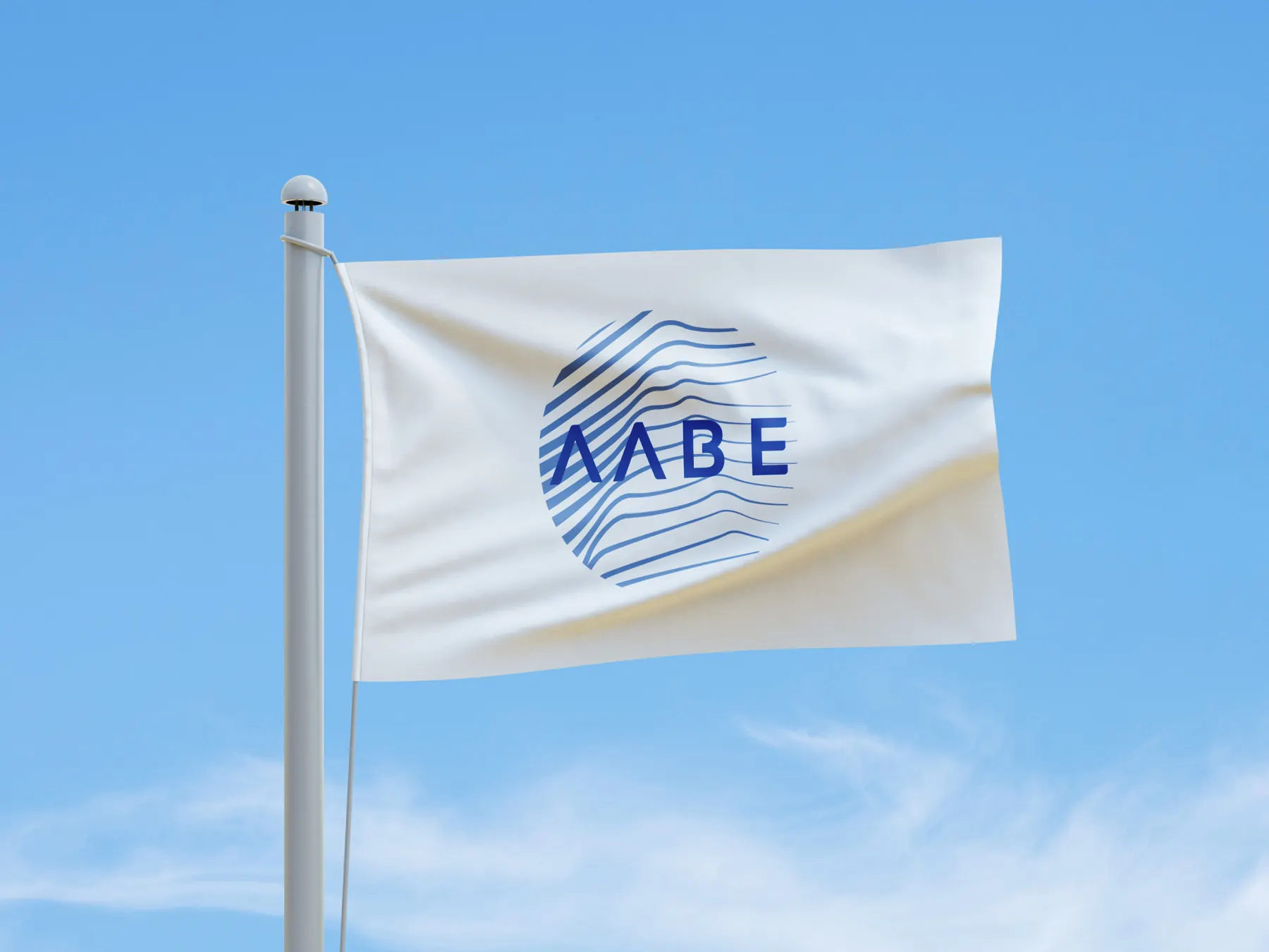
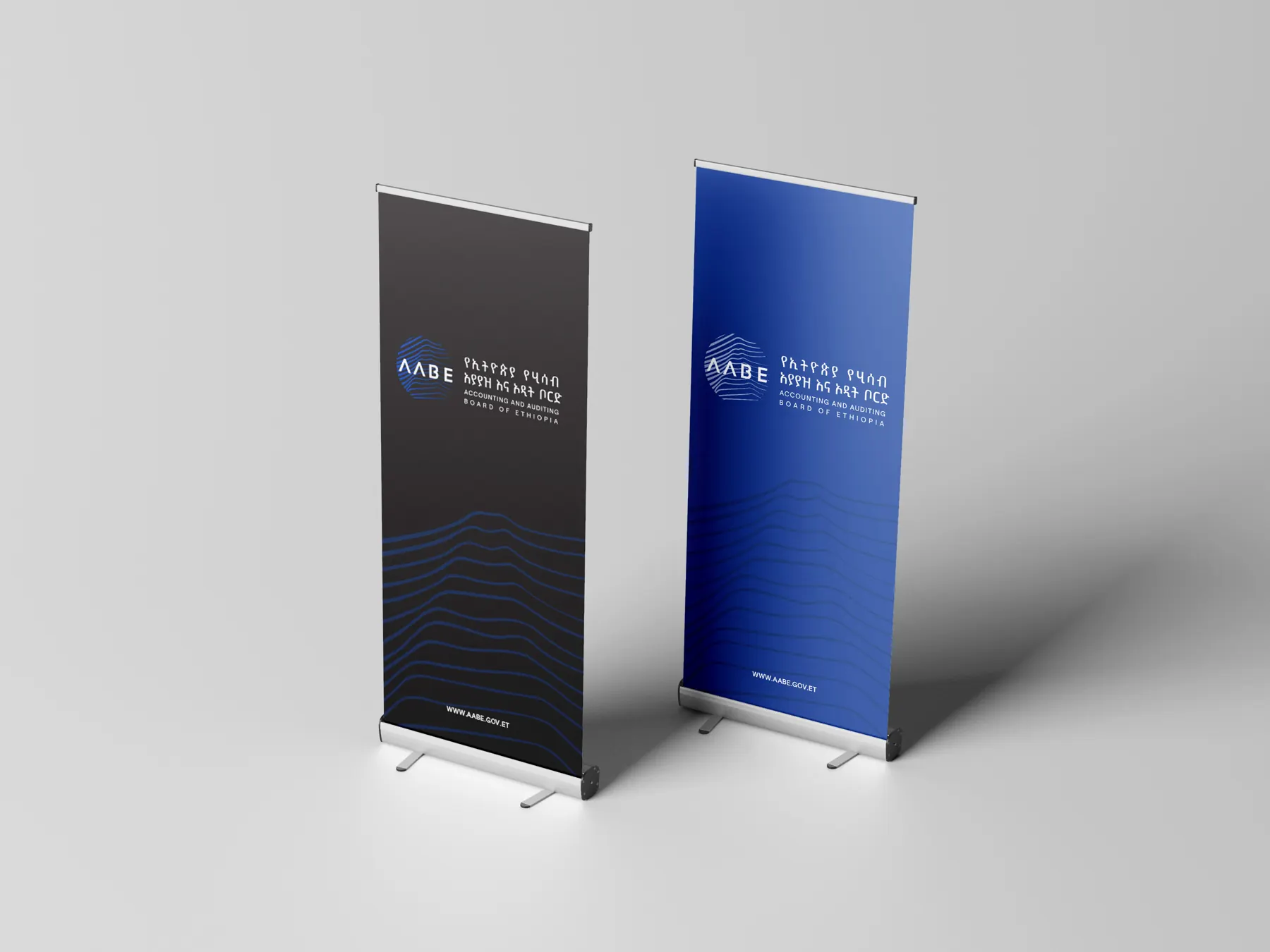
Out of doors and at events, the mark keeps its proportions and the lines keep moving.
Closing
One institution. One coherent identity.
The AABE identity brings together institutional purpose, strategic direction, and visual consistency in a system designed for everyday communication.
From the central mark to publications, professional materials, and public-facing environments, each element contributes to a recognizable expression of the institution's role and values.
Purpose, made recognizable
- Client
- Accounting and Auditing Board of Ethiopia (AABE)
- Project
- Brand Strategy and Visual Identity
- Services
- Brand Strategy · Visual Identity · Brand Guidelines · Collateral and Signage Design
- Languages
- Amharic and English
Our role
Resolution Studio developed the brand strategy, designed the logo and visual identity, wrote the brand guidelines and designed the stationery, publication templates, event materials and signage. AABE's mandate, programmes and communications are its own.